- A tagged PDF incorporates a tag structure that allows screen readers to interpret titles, paragraphs, lists, tables, and images.
- Accessibility in PDFs is based on standards such as WCAG and PDF/UA, and requires good source design, adequate contrast, alt text, and logical reading order.
- Tools such as Word, InDesign, and Adobe Acrobat Pro, combined with external validators, facilitate the creation and review of accessible PDF documents.
- Implementing a culture of accessibility and continuous training ensures that PDFs are inclusive, usable, and compliant with legal requirements.

If you work with digital documents daily, sooner or later you'll come across the concept of tagged PDFs or accessible PDFs . It might sound technical, but it's really about something as basic as ensuring that anyone, whether or not they use assistive technology, can read and understand the file without problems.
Beyond simply complying with the law, a well-tagged and accessible PDF improves the reading experience for everyone: it's easier to navigate, information is found faster, and it adapts to different devices. Let's take a look, calmly but directly, at what exactly a tagged PDF is, what standards govern it, and how to create one step by step using programs like Word, PowerPoint, InDesign, or directly in Acrobat.
What is a tagged PDF or accessible PDF?
A tagged PDF is a PDF file that includes an internal structure of tags that describe the content: titles, paragraphs, lists, tables, images, links… This structural layer is what assistive technologies (screen readers, braille devices, etc.) read to present the information in an orderly and understandable way.
In a standard PDF, the content might simply be a snapshot of the page, lacking order and meaning. In a tagged PDF, however, each element has a clearly defined role : what constitutes a heading, what is a list, which cell is a header in a table, what text describes an image, what is decorative, and so on.
For a PDF to be considered accessible, it is not enough to simply add four labels haphazardly: it must comply with certain international standards such as WCAG (from the W3C) and the PDF/UA standard (ISO 14289), which define what technical and content requirements must be met.
In practice, an accessible PDF should take care of at least these key aspects: labeling and logical reading order , alternative texts in images, choice of legible fonts, sufficient contrast between text and background, correct use of tables and lists, understandable links and basic metadata (title, language, author…).
Rules and benefits of an accessible PDF
Accessibility in PDFs is not just a good idea: in many contexts it is a mandatory legal requirement . The most important guidelines affecting PDF documents are:
On one hand, there are the WCAG (Web Content Accessibility Guidelines) , maintained by the W3C. Although they were created for websites, they also apply to any digital content, including PDFs. They define three levels of compliance (A, AA, and AAA), with level AA being the one typically required by laws and regulations.
In the legal sphere, the United States is notable for the ADA (Americans with Disabilities Act) and Section 508 of the Rehabilitation Act, which require that the electronic content of administrations and many private entities be accessible, which undoubtedly includes PDFs that are published or sent to the public.
In Europe, Directive (EU) 2016/2102 requires public administrations to ensure the accessibility of their websites and mobile applications, and by extension the documents they offer on them, applying WCAG 2.1 at AA level as a reference.
Respecting these rules reduces legal risks, but there are also very tangible benefits: an accessible PDF improves the user experience thanks to a clear heading structure, faster navigation through bookmarks, indexes and links, and content that is readable on all types of screens.
Another interesting side effect is that a well-tagged document is easier for search engines to index , which can slightly help SEO, especially if you link to the PDF from a relevant page or use it as a downloadable resource.
Prerequisites: design, content, and source document
Before even considering Acrobat or validators, accessibility begins with the design and content of the source document (Word, InDesign, PowerPoint, etc.). There are a number of prerequisites that should be kept in mind from the layout phase onward.
To begin, avoid basing instructions on purely visual features. Phrases like “press the round green button” or “see the text in the box on the right” are problematic for people with visual impairments or those using magnifying devices . It's better to use clear textual references: button name, field label, step number, etc.
It's equally important not to convey information solely through color. If the red bars in a chart are "important," that meaning must also be conveyed in the text or legend , because many people don't distinguish colors or use high-contrast modes that distort the palette.
Text-to-background contrast is another key element. WCAG standards specify minimum contrast ratios for normal and large text. In practical terms, it's important to ensure that the text doesn't get lost against the background . Tools like WebAIM Contrast Checker or Office's own accessibility checks can help measure this.
And a very direct warning: a PDF that is just a scanned image of a document will never be truly accessible unless it is converted to text using OCR (or regenerated from an editable original). Screen readers need text, not images of text.
Best practices in InDesign for accessible PDFs
If you're using InDesign for layout, you have many tools to ensure the PDF already has a very solid accessibility foundation . Ideally, everything should be prepared in-house, and Acrobat should only handle what can't be done there.
Some key best practices in InDesign include correctly defining document properties (title, author, subject) and always exporting PDFs as "Tagged PDFs." However, for tagging to be useful, simply checking the box isn't enough: you need to design the layout semantically.
Use paragraph styles for headings (H1, H2, etc.) instead of manually resizing them. Create lists using the list tools and tables using the table function; don't try to simulate them with tabs or floating boxes. This way, InDesign can export a correct label structure.
It's a good idea to create bookmarks and links within InDesign and ensure they are included in the PDF during the export process. This applies to both internal links (indexes, notes) and external URLs, which will then be used by screen readers and navigation tools.
Another strength of InDesign is its ability to mark images as decorative in the export options or add alternative text to informational images. You can also define header rows in tables so they are exported properly labeled.
However, there are things you'll have to finalize in Acrobat: defining the document language and the language of fragments in other languages, adjusting the window title to be the document title and not the file name, assigning specific tags (for example, for quotes), or adding advanced summaries to complex tables.
Best practices in Word and other text editors
In Word (and in general in office editors) the concept is very similar: the more you use the program's standard functions , the cleaner the exported PDF will be and the less work you will have afterwards.
Start by defining the document properties (title, author) and build a coherent heading structure: a single Heading 1 for the main title, Heading 2 for sections, Heading 3 for subsections, without abrupt jumps in hierarchy.
To create indexes, bookmarks , lists, footnotes, and tables in Word, always use Word's built-in tools. Don't "draw" tables with tabs or simulate columns with spaces. This way, when exporting as a tagged PDF, a semantic structure recognizable to screen readers will be maintained.
It's a good idea to avoid unnecessary floating text boxes. If you need to format in multiple columns, use Word's built-in columns feature, although sometimes the exported reading order may need to be checked later in Acrobat.
Images must have alternative text provided directly in Word, and tables must be created using the Table function with the header row selected. Additionally, Word includes an accessibility checker that detects many common accessibility issues before exporting to PDF.
Keep in mind its limitations: Word doesn't correctly export the document language or language snippets in other languages to PDF, it doesn't mark decorative images as such, and it doesn't export alternative text for links or table summaries to the PDF. You'll have to review and complete all of that later in Acrobat.
Tools for creating and reviewing accessible PDFs
To create and finalize accessible PDFs, you need to combine a good source program (Word, InDesign, PowerPoint, etc.) with specific PDF tools. Some are free and others are paid, and each has its strengths and weaknesses.
Among the free options, LibreOffice stands out as an open-source office suite that allows you to export tagged PDFs if the source document is well-structured. It can add some alternative descriptions to images and basic metadata, but it doesn't offer advanced tag editing after the PDF has been generated, nor does it have such comprehensive built-in validators.
Other free tools like PDFCreator allow you to convert to PDF from any printing application, adding certain metadata, although their accessibility approach is quite limited. Accessible PDF, on the other hand, is an online tool designed to convert Word or PowerPoint documents into accessible PDFs and even verify their accessibility, with the advantage of not requiring local installation.
In the paid professional arena, Adobe Acrobat Pro reigns supreme. It allows you to add and edit tags, set reading order, define languages, create and review bookmarks, check accessibility with an automated wizard, and fix many problems without touching the source document.
Microsoft Word (desktop and Office for the web versions) can also generate tagged PDFs directly from the "Save As" menu, provided you first run its Accessibility Checker and select the option to add structure tags when exporting. It doesn't replace Acrobat, but it does save a significant amount of work.
Another important paid tool is InDesign, which, in addition to laying out complex content, allows you to export directly to tagged PDFs—essential for long publications. However, some advanced features (languages, forms, summaries of complex tables, etc.) will still depend on Acrobat.
Plugins, validators and complementary utilities
Beyond the main software, there are specific utilities that facilitate the analysis and fine-tuning of accessibility in PDFs, very useful when you handle large volumes of documents or need a strict level of compliance.
One of the most widely used free tools is PAC 2021 (PDF Accessibility Checker), which analyzes a PDF and generates a fairly detailed report on its compliance with WCAG and PDF/UA: structure, tags, languages, metadata, reading order, etc. It's ideal for detecting problems that would otherwise go unnoticed.
AxesPDF is another solution focused on editing and reviewing accessibility in PDFs. It offers an interface designed to modify tags, adjust reading structures , and resolve errors detected by other validators, without having to struggle too much with the internal tree view.
CommonLook PDF Validator, which integrates with Adobe Acrobat Pro, takes professional validation a step further. It checks detailed compliance with standards such as WCAG 2.x and Section 508, and is highly valued in environments where accessibility is a strict contractual or legal requirement.
On the cloud document side, extensions like Grackle Docs for Google Docs help check document accessibility before exporting to PDF: they check headings, lists, images, tables, links, and suggest corrections in a guided way.
Finally, solutions like Equidox PDF allow you to convert PDFs into accessible versions through a web interface, automatically adjusting zones, tags, and structures. They are especially useful with legacy documents that cannot be regenerated from the original.
How to create a PDF accessible from the source (Word, PowerPoint…)
The best strategy is always the same: do the work well in the source document and leave the fine-tuning to Acrobat. In Word, PowerPoint, or similar tools, it's advisable to follow a consistent set of steps.
First, build the document structure using styles: headings, subheadings, body text, lists. Don't change the appearance "by eye" by increasing size and bolding; use heading and list styles, because that's what will later become H1, H2, L, LI, etc. tags.
Second, always add alternative text to images and graphics that provide information. In Word and PowerPoint, you can do this by right-clicking on the image and selecting "Alternative Text." Make sure the description is clear, brief, and relevant . If the image is purely decorative, there's no need to describe it.
Third, take care with the tables accessible in Word : create only the ones you need, avoid overly complex structures, and always select the header row. Tables should be used for data, not for layout. If you need a column layout, use the columns feature or slide layouts, not fake tables.
Fourth, make sure the color contrast and font legibility are adequate. Fonts like Arial, Verdana, or Helvetica, in reasonable sizes and without excessive shadows, underlines, or extravagant effects , usually work very well on screen.
Fifth, use descriptive link text: no "click here" or extremely long URLs. Instead, use "Download accessibility guide in PDF," which screen readers will understand in context.
Finally, always run the accessibility checker in Word or PowerPoint (on the "Review" tab). There you'll see warnings about headings, images without alternative text, problematic tables, or elements that could cause barriers.
Add and correct tags in an existing PDF with Acrobat Pro
If the PDF has already been created and there's no way to recreate the original, you have to work directly on the PDF . This is where Adobe Acrobat Pro becomes indispensable.
The first step is to open the document, go to “Tools > Accessibility,” and use the “Add Tags to Document” option. Acrobat will attempt to identify headings, paragraphs, lists, and tables. The result is never perfect, but it serves as a starting point.
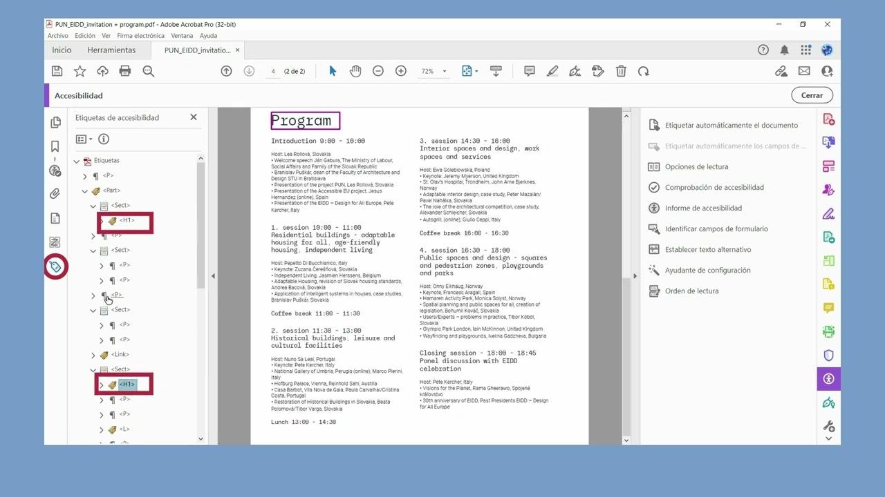
Next, from the "Tags" panel, you can view the PDF's structural tree. Here you can change tags (for example, transform a paragraph into an H2), reorder elements, check that the tags are properly nested, and that there are no absurd jumps in the hierarchy (such as going from H1 to H4 without any intervening H2 or H3 headings).
It is also essential to check the reading order (order panel). Content in two columns, for example, should have two distinct reading zones; otherwise, the screen reader will mix lines from both columns, alternating them.
This process also involves identifying which elements are decorative (lines, backgrounds, icons that do not provide information) and marking them as artifacts so that screen readers ignore them, avoiding unnecessary noise in the reading.
Semantic structure: headings, lists, and tables
Semantics is at the heart of a well-made tagged PDF . It's not enough for the document to "look nice"; for assistive technologies, what matters is how it's described internally.
Headings (H1, H2, H3…) define the logical structure of the content. Many screen reader users navigate by jumping from heading to heading, just as you might quickly glance at a text's table of contents. If the hierarchy is inconsistent, the experience will be chaotic.
Lists must use list tags (L, LI) and, if applicable, labeled list item tags. Creating manual lists with hyphens is not acceptable; the screen reader will not recognize it as a list and will read it as a string of unrelated paragraphs.
Regarding tables, each header cell must be labeled TH, and the others TD. For simple tables with one header row, it's usually enough to mark that row as the header. But for complex tables with multiple header levels, you'll need to use Acrobat's table editor to link data cells to their headers.
It's also advisable to add a title (caption) and, in some cases, a brief summary of the table, especially when it's dense or contains critical information. This is very helpful for users who need an overview before delving into the details.
Alternative text in images: when and how to do it right
One of the most obvious aspects of accessibility is the provision of alternative text for images . Without it, any graphic or photograph containing information becomes a "black hole" for those who cannot see it.
The purpose of alt text is not to describe every pixel, but to convey the same information that the image provides to the viewer. If a photo illustrates a concept in a purely decorative way, it can be marked as decorative and that's it. If a graph shows the evolution of some figures, the alt text should summarize that evolution.
In Acrobat Pro, you can go to "Accessibility > Set Alt Text" and the program will detect the images one by one so you can write the description. If the document already came from Word or InDesign with correctly formatted alt text, you'll only need to check it here.
When writing alt text, avoid phrases like "image of" or "photo of": the screen reader already indicates that it's an image. Get to the point with a short phrase that captures the key idea. And if the content is already clearly explained in the surrounding text, the alt text can be minimal, as long as it doesn't add unnecessary detail.
Common mistakes when trying to make a PDF accessible
When you're starting out, it's very easy to fall into recurring pitfalls that undermine a document's accessibility. Knowing them helps you avoid them.
One of the most common mistakes is forgetting to tag images or graphics, leaving elements containing relevant information without alt text. As a result, for many users, some of the content simply "disappears."
Another classic tactic is to use low-contrast color combinations or base messages solely on color (for example, in a results table: “those who failed are in red; those who passed are in green”). For someone with low vision or color blindness, this becomes an indecipherable code without textual support.
It's also common not to configure a logical reading order. Loose text boxes, poorly defined columns, marginal notes interspersed within the main text… All of this causes the screen reader to navigate the document in a way you would never think of, but which, for those who depend on it, is the only option.
Finally, many documents fail in the details: missing metadata, undefined document language, links with generic text, complex tables with no clear relationship between headers and data. These are things that can be quickly corrected with a validator and screen reader , but are easily missed if you only glance at the PDF.
Final check: validators and tests with screen readers
Before publishing or sending a PDF, it's worth taking a few minutes to properly check its accessibility . It's not enough to assume that because it comes from Word, "it'll be fine."
In Acrobat Pro, you can use the "Accessibility Checker." This tool analyzes your document and displays a list of errors and warnings: images without alt text, incorrectly sequenced headings, undefined language, forms without labels, etc. From each message, you can go to the specific point in the PDF and correct it.
Supplementing this with external tools such as PAC 2021 or CommonLook PDF Validator helps ensure that the document conforms to standards such as WCAG and PDF/UA, which is especially important in public administrations, education, and large organizations.
And, above all else, there's the real-world test with a screen reader like NVDA (free) or JAWS. Opening the PDF with Acrobat Reader, turning on the reader, and navigating with shortcuts (H for headings, T for tables, L for lists) lets you see how the document is actually perceived.
If you can also count on the feedback of real users who use assistive technologies in their daily lives, the improvements you will obtain will be even more closely aligned with reality.
Training and culture of accessibility in PDFs
Accessibility isn't a temporary fix; it's a way of working. For an organization's PDFs to be truly and consistently accessible, ongoing training and a strong internal culture are essential.
Standards evolve (WCAG 2.1, 2.2…), tools change, and workflows are updated. Staying current with specific document accessibility courses, official guides, and practical examples helps ensure that each new version of a document is better than the last.
It is very useful for content creators (writers, designers, layout artists, technical staff) to share best practices and accessible templates, and to establish small routines: always run the Office accessibility checker, review the PDF with a screen reader before publishing it, document the most delicate design decisions, etc.
In many cases, structured training in tools like Adobe Acrobat Pro, Word, or InDesign, specifically focused on PDF accessibility, saves hours of trial and error and last-minute uploads. Specialized centers offer specific courses on accessible PDFs that demonstrate, with examples, how to apply everything discussed here.
Adopting these good practices systematically makes a huge difference: documents cease to be "nice but inaccessible" and become resources that anyone can consult, understand and use, complying with regulations and, above all, respecting everyone's right to access information.


Passionate writer about the world of bytes and technology in general. I love sharing my knowledge through writing, and that's what I'll do on this blog, show you all the most interesting things about gadgets, software, hardware, tech trends, and more. My goal is to help you navigate the digital world in a simple and entertaining way.