- Organize the content by reducing cognitive load: one idea per slide, clear titles, and a logical sequence.
- It applies multimedia learning principles with minimalist design, good use of color, typography, and white space.
- Reinforce the message with images, graphics, subtle animations, and interactivity only when they contribute to understanding.
- Pay attention to the context: adapt your style to the audience, prepare the technical environment, and learn from practice and expert presentations.
If you want your audience to truly understand what you're saying, simply putting together a few pretty slides isn't enough: you need to improve comprehension in PowerPoint with a design tailored to the listener's brain , and you can use tools like Copilot to help . A presentation can be full of interesting data and still fail if it's poorly structured, overloaded with text, or designed without any pedagogical principles.
Throughout this article, you'll learn how to combine learning principles, visual design, and presentation techniques to create slides that are clear, easy to follow, and truly help your audience remember what you say. You'll find practical tips that you can apply in classrooms, scientific conferences, corporate meetings, or online courses, along with presentation software that simplifies the process.
Design with cognitive load and message structure in mind
The starting point for improving comprehension in PowerPoint is understanding that the brain has a limit to the amount of information it can process at once . This is called cognitive load, and if you overload it with slides, your audience will tune out or get lost along the way.
To avoid this, try to ensure that each slide conveys a single main idea or a very specific block of content ; use clever placeholders to organize elements and separate complex ideas across successive slides. Break down complex concepts into several slides so that it's easy to follow: first, introduce the idea, then develop it, and finally reinforce it with an example or a graphic.
Titles are your best ally: use clear, short, and descriptive headings that explain what the audience will find on that slide. Avoid cryptic titles like "Results (1)"; instead, opt for something like "Sales Evolution by Quarter." This helps focus attention and improves recall.
Progressive disclosure also works very well: it presents the basic ideas first and gradually adds complexity . Start with an overview, continue with the key details, and end with implications or conclusions. This order is much easier to digest than revealing everything at once.
When preparing your presentation, view it in "slide organizer" view and check if the presentation flows logically, if there are any abrupt jumps, or if any slides disrupt the flow . If a slide takes a long time to explain, it's usually a sign that the information should be spread across several slides.
Apply multimedia learning principles for better understanding
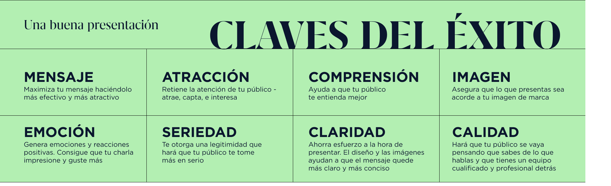
To improve comprehension in PowerPoint, you don't need to reinvent the wheel: there's a wealth of research in cognitive psychology and multimedia learning that indicates what works and what doesn't when combining text, audio, and images . Integrating these principles helps your audience learn more in the same amount of time, and you can leverage AI-powered tools to create images and presentations that simplify visual generation.
The first is the principle of coherence: eliminate anything that doesn't contribute. No garish backgrounds, unrelated decorative images, distracting visual gags, or irrelevant blocks of text . Every element on the slide must have a clear function to support your message; otherwise, it's superfluous.
The second is the principle of contiguity, which basically states that audiences learn best when related text and images are close in space and time . Avoid placing an image above and the explanation in a paragraph below, separated by a gap, or explaining a graphic many seconds after showing it; instead, place labels, arrows, or brief texts next to the visual element to make the connection immediate.
You should also keep in mind the principle of redundancy: if you put an entire paragraph on screen and then read it word for word, you're overloading people with the same information twice. It's more effective to use very brief bullet points on the slide and elaborate on the explanation with your voice , or have the key part spoken while the slide only reinforces it with a diagram or image.
When preparing your educational presentations, combine these ideas with a clear narrative: state objectives, develop ideas from simple to complex, and conclude by reinforcing the key points . This aids retention, as the audience can transfer what they have learned to other contexts.
He masters minimalism, white space, and composition.
One of the most common mistakes when creating slides is thinking that "if I fill the space, it will look like I've put in more work." In reality, the opposite is usually true: the more cluttered a slide is, the harder it is to understand and the faster the audience tunes out.
Adopting a minimalist approach doesn't mean your slides have to be boring; it simply means using only the elements necessary for your message to be clear . Prioritize short phrases, keywords, and simple diagrams over long paragraphs.
White space (or negative space) isn't wasteful; it's a design asset. It leaves clear areas around text and images so the eye can rest and important elements can breathe . You'll find that by reducing visual clutter, readability improves immediately.
Pay attention to the composition as well: use similar margins on all slides so that the whole thing looks tidy, take advantage of PowerPoint's alignment tools to perfectly position text, icons, and shapes , and avoid anything that looks haphazard or slightly crooked, because it gives an unprofessional impression.
Finally, review the content density of each slide. If you see that one slide has significantly more text or elements than the others, it probably needs to be split into two or three shorter slides . Remember: there's no magic rule of X slides per minute; use as many as you need to explain your topic effectively within the allotted time.
Choose your fonts, colors, and screen format carefully.
The visual aspect isn't just an aesthetic whim: typography, color, and format directly influence how easy your presentation is to read and understand . Poor contrast or an obscure font can ruin even the best content.
As for fonts, opt for sans-serif typefaces for the body text, as they are easier to read on screen: Arial, Calibri, Roboto, Open Sans , or similar fonts are safe bets. You can use a second, slightly bolder typeface for headings, but try not to use more than two different fonts to maintain consistency.
Pay attention to the font size: always consider the people sitting at the back of the room or watching the presentation on a small screen. A font size that's too small will cause the audience to waste time and effort trying to decipher what it says instead of listening to you. Also, leave space between lines so the text doesn't look like a dense block.
Color matters too. Avoid overly bright shades, such as neon yellows or highly saturated oranges, especially as a background color. It's preferable to use limited and consistent palettes, aligned with your brand or center's visual identity . PowerPoint includes predefined color combinations that you can customize to match your corporate colors.
Regarding contrast, the combinations that work best for comprehension are dark text on a light background or very light text on a dark background . Before the actual presentation, test how it looks on the projector in the room, as colors can vary considerably from your monitor. If the room cannot be darkened significantly, a light background with dark text is usually the most legible option.
Don't forget the slide format: nowadays almost all screens (computers, tablets, mobile phones, and modern projectors) work in 16:9. Change the slide size in PowerPoint to use this widescreen format to make better use of the visible space and avoid black bars or distortions when you project it or embed it on virtual platforms.
Use images, graphics, and multimedia with a pedagogical purpose.
When used effectively, images, graphics, icons, and videos can make your message much more intuitive and memorable . The problem arises when visual elements are added simply "to make it look prettier," without considering whether they actually aid understanding.
When choosing images, always prioritize quality and relevance. A pixelated, distorted, or generic stock photo conveys a lack of professionalism and is more distracting than helpful. Adjust the size while maintaining the original aspect ratio and respect copyright by using royalty-free stock images or your own material.
If the photograph fills the entire slide background, it's often a good idea to use a semi-transparent rectangle beneath the text to ensure readability. A simple transparent shape placed between the image and the text makes the message legible without sacrificing visual impact . You can also easily import and organize photos if you know how to create presentations with Microsoft Photos.
Charts are especially useful for numerical data, provided you choose them wisely. For proportions, pie charts with few slices work well ; for comparisons between groups or changes over time, vertical or horizontal bars are clearer; and for trends over time, the classic line graph is ideal. Avoid pasting Excel spreadsheets full of numbers that no one will have time to read.
In addition to still images, you can incorporate short videos or audio clips. A short, strategically placed video breaks up the flow, recaptures attention, and better illustrates a complex concept . However, be mindful of the video's duration and always check before the presentation that the file plays correctly on the room's equipment; and remember to adjust the video quality when exporting to avoid playback issues.
Integrate interactive elements and simulations where it makes sense
Interactivity is one of the most effective ways to improve comprehension in PowerPoint because it compels the audience to actively participate rather than simply listen . Not all presentations need it, but in training or internal projects, it can make all the difference. You can learn how to create interactive PowerPoint presentations using buttons and internal links.
With PowerPoint's built-in features, you can add hyperlinks, action buttons, navigable menus, simple polls, drag-and-drop activities, or short quizzes. These resources allow your audience to make decisions, answer questions, or explore content at their own pace. If you want to take things a step further, you can even create interactive games in PowerPoint to reinforce learning.
In educational or corporate training settings, you can go a step further and use external tools that integrate with PowerPoint to create simulations or interactive scenarios. These environments allow you to recreate real-life situations where participants put their knowledge and skills into practice without risk , fostering a deeper understanding. It's also possible to embed mini-applications that expand the possibilities for interaction.
However, don't fall into the trap of adding interactivity just because it's trendy. Always ask yourself if that quiz, button, or simulation actually helps to reinforce or apply the content . If it only complicates navigation or wastes time without contributing to learning, it's best to do without it.
If you decide to use collaborative tools (online whiteboards, live voting forms, shared documents, video conferencing platforms with integrated polls, etc.), coordinate them with your presentation so that the experience is seamless and the audience perceives a clear thread between what they see on the screen and what they do.
Master animations, transitions, and the pacing of the presentation
Animations and transitions can be key to improving comprehension in PowerPoint, but only if you use them judiciously. The temptation to try all the available effects is strong, but too many movements, sounds, or jarring turns distract more than they help.
Use animations to pace the information on a single slide : first the title, then the first point, then the second, and so on. This allows you to guide the audience's attention and prevent them from reading all the content at once before they hear you speak. Subtle effects like "Appear," "Fade Out," or "Move Out" are usually more than enough. If you need advanced effects, learn how to create a 3D presentation with animation for specific situations.
Something similar happens with slide transitions. A subtle change like "Fade" or "Push" adds fluidity without drawing attention to itself, while very flashy transitions can make people focus more on the effect than on what you're saying . Check your entire presentation in presentation mode to make sure nothing is out of sync or appears out of time.
The key is for the animation to be almost imperceptible and simply reinforce the message. For example, you can use a slight zoom to highlight a particularly relevant piece of data or make a circle appear that emphasizes the exact point on a graph you're discussing . The important thing is that every movement has a purpose.
In addition to this, pay attention to the pace of your presentation: respect the allotted time, avoid dwelling on a single slide, and try to minimize long gaps without visual changes if the talk is lengthy . Alternating diagrams, charts, images, and brief pauses for questions helps maintain attention.
Tell a story and adapt the design to the occasion.
However technical or formal your presentation may be, incorporating narrative elements makes all the difference. People remember a message much better when it's integrated into a story with context, conflict, and resolution than when it's simply a list of isolated points.
Think of your presentation as a story: who is the protagonist (the company, the project, your students, a typical patient…), what problem do they have, what path has been followed, and what results have been achieved? From there, structure the slides to follow that journey, taking the audience from the initial situation to the solution.
PowerPoint also lets you add voice narration to your slides, which is very useful if you're going to share the presentation for later viewing. This way, even remotely, your story travels with the file and isn't limited to just the on-screen text , which is often insufficient to convey all the nuances.
At the same time, always adapt your presentation style to the context. You wouldn't use the same visual tone or information density when presenting an educational video game to executives at a tech company as you would to a group of elementary school teachers or a scientific committee. Adjust your language, examples, technical depth, and aesthetics to suit your target audience.
If you want to strengthen your personal or corporate brand, create your own template instead of sticking with the standard designs everyone has seen a thousand times. Define a consistent color scheme, fonts, and styles, and save it as a theme to maintain a recognizable visual identity across all your presentations and documents.
Prepare the technical environment and your own performance
Understanding also suffers when the technical aspects fail. Small details like a poorly adjusted projector, a file that won't open, or a screensaver popping up mid-talk can break the flow and cause the audience to lose focus.
Arrive at the venue where you will be presenting early and check that everything is working: projector resolution, cable connection, PowerPoint version, sound for the videos… If possible, bring the presentation on a USB drive and also in the cloud (for example, on OneDrive) to have a backup plan in case of unforeseen events.
Disable screen savers and pop-up notifications before you begin, and check the readability of colors and sizes on that same screen. What looks perfect on your monitor may lose contrast or appear cropped on the projection if the resolution doesn't match.
During your presentation, avoid unconsciously moving your mouse pointer, because it's surprising how distracting a cursor wandering across the slide can be . When you don't need it to point to something specific, put the mouse down and focus on making eye contact with your audience.
And please, don't read the slides word for word. Rehearse enough so you can speak naturally, using the bullet points only as a guide. This way, the text on the screen supports your audience, not replaces what you should be explaining in your own words.
Learn from the experts and optimize with practice
No one is born knowing how to give brilliant presentations. A quick way to improve is to observe what others do well: websites specializing in templates, presentations by top speakers, award-winning teaching materials , or talks that have impressed you personally.
Analyze the types of slides they use, how they combine images and text, how they structure the sections, their pacing, and how they interact with the audience. It's not about copying designs verbatim, but about understanding the underlying principles and adapting them to your style and content.
You can also download professional templates (many are free) and study them: observe how they handle alignment, margins, visual hierarchies, icon use, colors, and typography . Then, adjust those resources to fit your visual identity and specific needs.
Every time you present, pay attention to the audience's behavior: when they look at the screen with interest, when they start looking at their phones, which slides generate questions, and which ones seem to confuse them. This observation is invaluable for improving your future presentations and polishing the parts that weren't understood as you expected.
Over time, you'll develop your own criteria and discover which slide style best suits you and your type of content. The important thing is to keep learning, try variations, and not settle for the same old thing if you see it's not working quite right.
When you combine a clear structure, clean design, well-chosen visual resources, moderate use of animations and interactivity, and good technical preparation, your presentations cease to be mere visual aids and become a powerful tool that makes it easy for your audience to follow the thread, understand what you are saying, and remember it long after they have closed PowerPoint.

Passionate writer about the world of bytes and technology in general. I love sharing my knowledge through writing, and that's what I'll do on this blog, show you all the most interesting things about gadgets, software, hardware, tech trends, and more. My goal is to help you navigate the digital world in a simple and entertaining way.