- ClearType is a native feature of Windows which significantly improves the readability of the text on the screen.
- Allows you to customize the appearance of the text through a wizard and advanced changes from the registry.
- Its activation and configuration is simple and accessible for both beginners and advanced users.
Have you noticed that there are times when the text on your computer appears blurry or unclear? Many people spend hours in front of a screen, and with the advent of remote work, this is even more common. Windows has a little-known tool that can make reading much more comfortable: ClearType. Although often overlooked, enabling and configuring it can make a noticeable difference to your eyes. If you don't know how to do it or want to discover all the details and advanced options, here's the most complete and simple guide on how to activate and adjust ClearType in Windows.
In the next sections you will discover What ClearType really is, how you can activate it step by step, and how you can customize its settings even in the Windows registry itself to adapt it to your taste and needs. Plus, you'll learn the advantages, possibilities, and alternatives to get the most out of this feature, regardless of the type of monitor you use.
What is ClearType and why should you turn it on?
ClearType is a technology developed by Microsoft with the aim of improve the readability of texts on LCD screens, such as portable, flat panel monitors and mobile devicesIts main function is to make letters appear sharper, clearer, and easier to read, which is especially helpful if you spend long hours working in front of a computer or if some fonts are difficult to distinguish.
The operation of ClearType is based on take advantage of the subpixels of LCD screens to soften letter edges and refine contrast. This makes words more distinct and reduces eye strain, giving you a much more comfortable reading experience. This system It is natively integrated into Windows 10 and Windows 11, so you don't need to install any extra programs.
When you activate ClearType, the system itself offers you a wizard to adjust the text to what you see best. This allows any user, even those without technical knowledge, to optimize their reading experience in just a few minutes. Additionally, for more advanced users, there are additional options from the Windows Registry to further customize the display.
Advantages of using ClearType on your computer
Using ClearType in Windows It belongs to a series of benefits that can be appreciated from the first moment:
- Improve text sharpness: Letters look sharper and clearer, especially on LCD screens.
- Reduce the visual fatiga: By making reading easier, you prevent eye strain from occurring during prolonged sessions.
- Allows custom fit: The ClearType Wizard helps you choose the settings that best suit your vision and the quality of your display.
- Activated without additional installations: It is a native Windows feature that is configured in a few steps.
- Includes advanced options: Experienced users can adjust specific settings from the registry to tailor the experience to specific monitors or highly customized preferences.
These advantages have made ClearType a feature especially valued by those looking for a optimal reading experience in your daily life, both for working and enjoying digital content.
How to activate ClearType step by step in Windows
Enable ClearType in Windows It is a simple process that anyone can perform without difficultyHere we explain the two main ways: through the Start menu and through the Run box.
Option 1: From the start menu
- Click the Windows Start button.
- Type “ClearType” in the search bar.
- When the “Adjust ClearType Text” option appears, select it.
- The setup wizard will open in a new window.
Option 2: Using the Run box
- press the combination Windows + R to open the Run window.
- Write cttune.exe and press Enter.
- This will open the “ClearType Text Optimizer” directly.
Both methods take you to the same place; the only difference is which one you prefer for convenience. The wizard is identical in both cases and is entirely in Spanish.
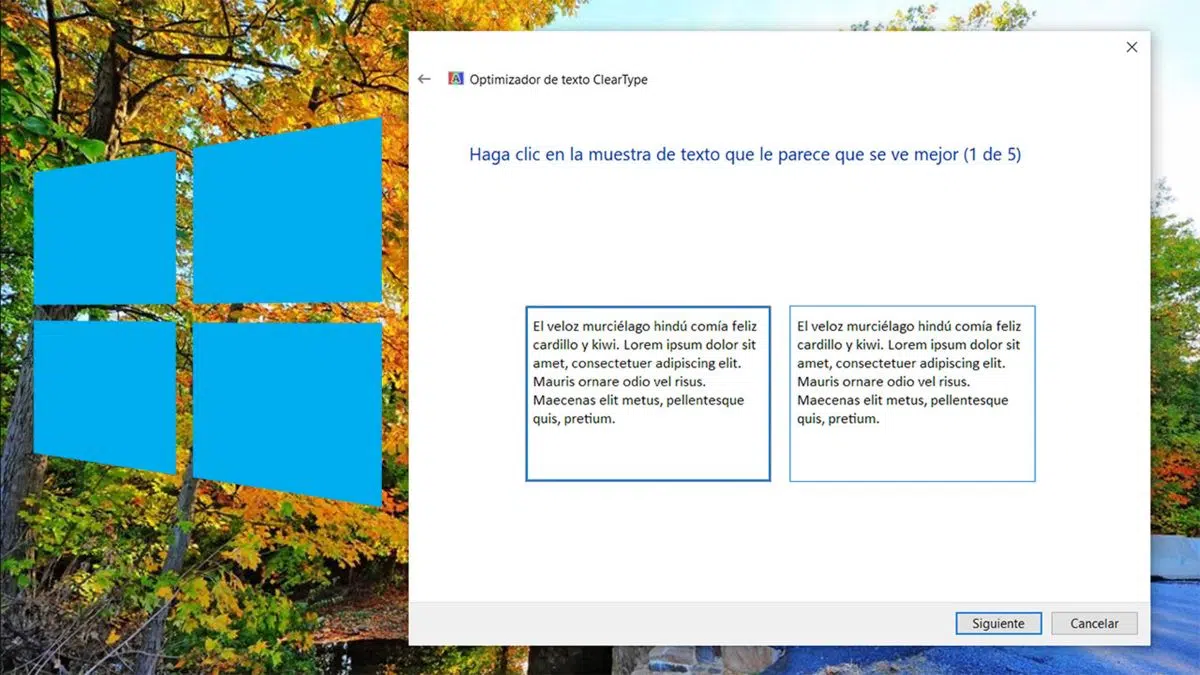
Configuring ClearType: The Calibration Wizard
Once the wizard is open, the process to customize ClearType is very intuitive:
- The first screen allows you to enable or disable ClearType by checking or unchecking the corresponding box.
- The system will automatically check your monitor resolution and notify you if you need to make any adjustments, although you can usually continue without further changes.
- A series of events then begins five steps where you will see several text samplesIn each of them, simply choose the option that is clearest and most comfortable for your eyes.
- After completing all the steps, a message will appear indicating that the optimization is complete, and all you have to do is click the Finish button.
Done! From that moment on, the text on the screen will look different depending on your choices, allowing you to enjoy a more comfortable and clear reading.
ClearType differences depending on the monitor and configuration
ClearType is specifically designed for modern LCD displays. If you're using an older monitor or CRT, you might notice a minor improvement, but on laptop monitors, flat-panel displays, or tablets, the jump is noticeable. The way the settings appear may vary depending on your monitor's pixel configuration, although the default settings usually work perfectly for most users.
Although ClearType is optimized for the most common subpixel sequence (RGB: red, green, blue), some monitors use the RGB order. If you notice that letter colors appear odd or that there are colored edges in text, you can also modify the pixel structure in Advanced Settings or the Windows Registry to achieve a more accurate display.
Advanced Options: Configuring ClearType from the Windows Registry
For those looking for complete customization, Windows allows you to modify specific ClearType settings through the Registry Editor. This option is recommended only for advanced users, as it requires caution. The main values you can adjust are:
- ClearType Level: Adjusts how much color lightness is applied to the text, with values from 0 (grayscale) to 100 (maximum effect).
- Gamma level: Controls the luminance of the pixels, with values from 1000 to 2200, with 1900 being the standard.
- Pixel structure: Defines whether the display is flat, RGB or BGR, modifying the way text is rendered.
- Text contrast level: Adjusts the thickness and contrast of the letter lines, in values from 0 to 6.
The keys in the registry are usually found in:
- HKEY_CURRENT_USER\SOFTWARE\Microsoft\Avalon.Graphics\ for user values.
- HKEY_LOCAL_MACHINE\SOFTWARE\Microsoft\Avalon.Graphics\ for global values.
To modify these values, proceed with caution and only if you are experienced in editing the registry, as incorrect settings can affect your screen display.
ClearType and Microsoft Edge: Improving Web Browsing
ClearType also influences the display of text in browsers. Many users notice a difference in sharpness when using Microsoft Edge or other Chromium-based browsers, especially for long reads or with less conventional fonts. The settings in the operating system ensure that the enhancement is applied to all programs, including browsers.

Tips for getting the most out of ClearType
If after turning on ClearType you find that the text is still not as clear as you expected, consider these tips:
- Check your monitor resolution: Make sure to always use the recommended resolution for optimal performance.
- Run the wizard again: When you change screens or adjust settings, calibrate again.
- Use good quality cables: Defective or low-quality cables can affect image quality and impair the effectiveness of ClearType.
- Check your monitor settings: If you notice color or edge abnormalities, reset your monitor settings or modify the pixel structure in the advanced options.
Small details like these can enhance the reading experience and tailor the display to your personal preferences.
Alternatives and other recommendations to improve readability in Windows
While ClearType is one of the best options, there are other features and programs that can complement or further enhance the display:
- Adjusting text size and scale: From the display settings you can increase the text size and adjust the scale.
- High Contrast Mode: Recommended for people with visual impairments, it highlights key elements and makes reading easier.
- Monitor calibration software: Specific tools for adjusting contrast, brightness and color temperature, complementing the ClearType functions.
For many users, simply enabling ClearType is a significant improvement, although exploring these alternatives can be helpful for those who need more customized settings.
ClearType is an effective and easy-to-use tool for improving readability in Windows, helping you protect your eyes and enjoy digital content more.
Passionate writer about the world of bytes and technology in general. I love sharing my knowledge through writing, and that's what I'll do on this blog, show you all the most interesting things about gadgets, software, hardware, tech trends, and more. My goal is to help you navigate the digital world in a simple and entertaining way.