- Color Picker of power toys allows you to capture any color on screen, with history, pixel zoom, and customizable formats.
- The editor integrates fine-tuning (HSV, RGB, HEX), similar variants, history export, and advanced format management.
- Snips is testing a native eyedropper (Insider) that displays HEX, RGB, and HSL, geared toward quick queries.
If you work with design, development, or just like to nail the tone of a color you see on screen, the color picker in Windows 11 It will make your life easier. Today's protagonist is Color Picker by PowerToys, a utility that captures colors from any point on the desktop and copies them to the clipboard in different formats.
Additionally, Microsoft is testing an eyedropper built into the Snipping Tool for the Insider channel, and for those who create apps, there is the WinUI ColorPicker control. In this guide we put all those pieces together.: How to enable and use Color Picker in PowerToys, what its editor offers, how to customize formats, its limitations, what's cooking in Snipping Tools, and how to take advantage of color control in XAML.
What is Color Picker in PowerToys and what is it for?
Color Picker is part of microsoft power toys, the advanced utilities pack for users of Windows. Its function is to allow you choose colors from any screen (applications, web, images, videos, etc.) and copy the result to the clipboard in the format you prefer: HEX, RGB, HSL and many more.
It is designed to accelerate the workflows of creative and technical people: designers, developers and content creators who need to capture accurate tones quickly, reuse them, and maintain a history of recent selections.
Installing PowerToys and activating Color Picker
To use the classic color picker in Windows 11, you'll need PowerToys. Installation is very simple: Download it from the official Microsoft website and install it like any other program.
Once installed, open PowerToys and go to the “Color Picker” section. Turn on the switch to enable the utility and check the default keyboard shortcut.
The standard shortcut to start the dropper is Win+Shift+C, although you can create custom shortcutsAfter clicking it, you'll see a zoom under the cursor and can hover over any pixel to read and copy its color.
If you're interested in a very straightforward guide, here are the quick steps: Install PowerToys, enable Color Picker and activate with Win + Shift + CWhen you click, the color is copied to the clipboard; you can then paste it wherever you need it.
How it is activated and what behavior you can choose
PowerToys lets you decide what happens when you activate the dropper. In “Trigger Behavior” you have two options: : open the editor directly or first choose a color on screen.
If you choose “Open Editor,” the Color Picker editor window will appear with the history and formats visible for you to adjust and copy. If you select “Choose a color first”, you will enter eyedropper mode directly and, after clicking, you will be able to act on that color.
Selecting colors on screen: zoom, mouse buttons, and clipboard
When you activate the eyedropper you will see an enlarged area under the cursor; You can move the mouse wheel to zoom in or out and thus fine-tune the pixel. It's ideal for capturing edges or tiny details.
Mouse button actions are configurable in the Color Picker module within PowerToys. By default, the utility assigns these actions for each button when active:
| Mouse button | AGENDA | That makes |
|---|---|---|
| Left click | Select color and open editor | Copy the color to the clipboard, adds it to the history and opens the editor. |
| Click with the wheel | Select color and close | Copy to the clipboard, save to history and close the selector mode. |
| Right click | CLOSE | Exit the selector without copying the color. |
When you choose a color, it is automatically copied to the clipboard using the default format that you have configured (by default it is HEX, check color codes in HTML). In the editor you can copy any other visible format with an additional click if you need it.
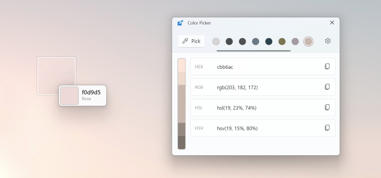
Color Picker Editor: History, Fine-Tuning, and Similar Colors
The Color Picker editor saves up to 20 recent colors so you don't lose what you've already captured. From there, you can copy to your preferred format, adjust the color, and export your collection.
The color bar at the top is the key: By clicking on the central color you enter the fine adjustment, with controls for HSV, RGB, and HEX. This allows you to precisely tweak the value until you find the hue you're looking for.
Color variations are shown at the top and bottom of that bar. By clicking on one of those segments you choose a similar color, which is added to the history to have very close variants ready to copy.
If you no longer need a color, simply right-click on it and choose “Remove.” You can also export the history right-click and “Export”, grouping by color or format as you see fit.
In addition, the editor is configurable: decide which color formats you want to see to speed up your workflow. In PowerToys Settings, within Color Picker, you can activate, reorder, and hide formats.
Main configuration options
The Color Picker module includes several useful preferences. These are the most relevant ones to personalize the experience:
| Configuration | Description |
|---|---|
| Activation key combination | Shortcut which launches the color picker (by default, Win + Shift + C). |
| Activation behavior | Choose if open editor o select a color first when activating the tool. |
| Mouse actions | Configure what each button does while Color Picker is active (left click, wheel and right click). |
| Default color format | Define the default format which is copied to the clipboard (HEX, RGB, etc.). |
| Display color name | Activate a high-level label such as “Light Green”, “Green” or “Dark Green”. |
| Color formats | Enable, add and reorders formats visible in the editor. |
Manage color formats: add, edit, disable, and sort
From the formats section, you can add custom formats, edit them, delete them, temporarily disable them, and change their order so they appear in the editor in the sequence you prefer.
To reorder, press the “more” button (••) next to a format and choose Up or downIf you prefer to hide it without deleting it, turn off its switch; disabled formats won't appear in the editor.
If you need to remove one completely, go back to “more” (••) and press Delete. To create a new one, use “Add Custom Color Format” and enter Name and Format following the syntax indicated in the dialog box.
When editing an existing format, select its entry and adjust Name and Format in the “Edit Custom Color Format” window. Below, you’ll see help with the tokens available for building your chain.
These are the parameters you can use to define the output of a custom format; Each token represents a color component or derived data:
| Parameter | Meaning |
|---|---|
| %Re | Red |
| %Gr | Verde |
| %Bl | azul |
| %To the | alpha |
| %Cy | cyan |
| %Ma | magenta |
| %Ye | yellow |
| %Bk | black key |
| %Hu | hue |
| %Yes | saturation (HSI) |
| %Sl | saturation (HSL) |
| %Sb | saturation (HSB) |
| %Br | gloss |
| %In | data usage |
| %Hn | hue (natural) |
| %Ll | (natural) light |
| %Lc | light (CIE) |
| %Goes | value |
| %Wh | whiteness |
| %Bn | darkness |
| %AC | chromaticity A |
| %Cb | chromaticity B |
| %Xv | X value |
| %Yv | Y-value |
| %Zv | Z value |
| %Dv | decimal value |
| %Na | color name |
The red, green, blue and alpha channels support different formatters to define how they will be displayed (for example, in bytes, in hex, or as floats):
| Formatter | Meaning |
|---|---|
| b | value in bytes (predetermined) |
| h | hex one digit |
| H | HEX one digit |
| x | hex two digits |
| X | HEX two digits |
| f | float with initial zero |
| F | float without a leading zero |
For example, "%ReX"represents the red value in two-digit hexadecimal and in uppercase. You can mix text and tokens: a sample format could be new Color (R = %Re, G = %Gr, B = %Bl).
Current limitations of Color Picker
Like any tool, it has its limits. There are contexts in which it is not shown above, such as the Start menu or Action Center; you can still select a color behind it.
If the focused application is running as administrator, the activation shortcut will not respond unless PowerToys also runs with elevated privileges. This is a system security restriction.
Lastly, WCG or other content is not supported HDR for now, so colors in wide gamut or high dynamic range spaces are not captured accurately.
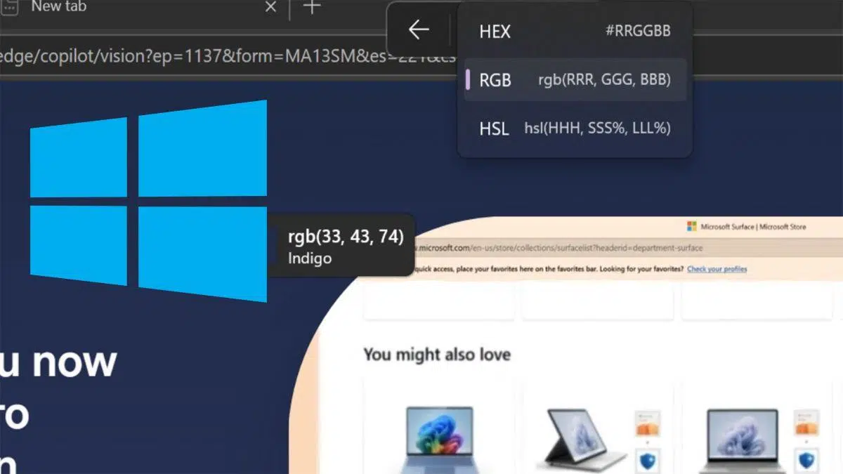
New: Eyedropper in the Snipping Tool (Insider)
In Windows 11 preview builds for the Insider Channel, The Clippings app includes an eyedropperYou'll see a dropper icon in the toolbar when you open the tool.
When you activate it and hover the mouse, the system displays three color codes: HEX, RGB and HSLIt's a simple, highly intuitive solution, designed for quick queries without installing anything additional.
At the moment the feature has only reached some Insider users, so it's not available in the stable version. It's quite likely that it will be rolled out to more devices in the coming weeks, but it will depend on Microsoft's release plan.
Specialized media have covered this new feature, commenting that until now Windows 11 did not include a native launcher outside of PowerToys. ComputerHoy points this out in its articles (tags: Windows 11), and remember that the Snipping Tool is constantly getting better.
Quick Steps with PowerToys Color Picker
If you want a minimalist checklist to get you started, here it is. It's three steps and that's it. to capture colors like a shot.
- Install PowerToys: download from the official website and install the package.
- Enable Color Picker: Open PowerToys, go to “Color Picker” and activate the switch.
- Activate eyedropper: uses
Win + Shift + C, hover over a color and click to copy its code to the clipboard.
If you want to expand and see advanced settings, the PowerToys module itself guides you through it, and there are also third-party articles that explain it step by step. There is even a reference on winsides.com with a specific guide on Color Picker.
Recommendations for use and selection experience
Before you go crazy with a thousand options, think about your scenario. For informal uses, a simplified selector speeds up the task; for precision tasks, it is advisable to expose detailed controls.
For maximum accuracy, use the color spectrum in square with a minimum size of 256 × 256 or enable text boxes to adjust numerical values. This is the way to nail down a precise color.
If you use the selector inside a floating control, which touching the spectrum or moving a slider does not confirm on its own. Adds Confirm/Cancel buttons and allows you to discard by pressing outside or using the Back button.
In practice, many flows work better if you just apply the choice when confirming or closing the flyout. Otherwise, you can temporarily save the color and apply it later.
ColorPicker for Developers: Creating Color Pickers in XAML
If you build desktop applications with WinUI 3 or UWP/WinUI 2, you have a ColorPicker control ready to use. Allows square or ring spectrum, RGB/HSV/HEX fields, preview and more.
Minimal XAML example for WinUI 3: a default color picker that you can read from code.
<ColorPicker x:Name="myColorPicker" />For immediate reactions, you can bind the Color property to a fill brush and see the changes in real time on a visual element.
<ColorPicker x:Name="myColorPicker" ColorSpectrumShape="Ring" IsColorPreviewVisible="False" IsColorChannelTextInputVisible="False" IsHexInputVisible="False" />
<Rectangle Height="50" Width="50">
  <Rectangle.Fill>
    <SolidColorBrush Color="{x:Bind myColorPicker.Color, Mode=OneWay}" />
  </Rectangle.Fill>
</Rectangle>
If you prefer to confirm at the end, host the selector in a flyout with OK and Cancel buttons. This way, you only apply the color when the user validates it.
<Page.Resources>
  <Flyout x:Key="myColorPickerFlyout">
    <RelativePanel>
      <ColorPicker x:Name="myColorPicker" IsColorChannelTextInputVisible="False" IsHexInputVisible="False" />
      <Grid RelativePanel.Below="myColorPicker" RelativePanel.AlignLeftWithPanel="True" RelativePanel.AlignRightWithPanel="True">
        <Grid.ColumnDefinitions>
          <ColumnDefinition />
          <ColumnDefinition />
        </Grid.ColumnDefinitions>
        <Button Content="OK" Click="confirmColor_Click" Margin="0,12,2,0" HorizontalAlignment="Stretch" />
        <Button Content="Cancel" Click="cancelColor_Click" Margin="2,12,0,0" HorizontalAlignment="Stretch" Grid.Column="1" />
      </Grid>
    </RelativePanel>
  </Flyout>
</Page.Resources>
<Grid>
  <Button x:Name="colorPickerButton" Content="Pick a color" Flyout="{StaticResource myColorPickerFlyout}" />
</Grid>
private Color myColor;
private void confirmColor_Click(object sender, RoutedEventArgs e)
{
// Asigna el color seleccionado a una variable para usarlo fuera del flyout.
myColor = myColorPicker.Color;
// Cierra el Flyout.
colorPickerButton.Flyout.Hide();
}
private void cancelColor_Click(object sender, RoutedEventArgs e)
{
// Cierra el Flyout.
colorPickerButton.Flyout.Hide();
}You can configure the shape of the spectrum. A ring is more informal, while the square offers greater range and accuracy.
<ColorPicker x:Name="myColorPicker" ColorSpectrumShape="Ring" />You can also show the alpha channel for opacity and its associated text box.
<ColorPicker x:Name="myColorPicker" IsAlphaEnabled="True" />If you want a cleaner interface, hide preview and text inputs to offer a simple selector ring and slider based.
<ColorPicker x:Name="myColorPicker"
             ColorSpectrumShape="Ring"
             IsColorPreviewVisible="False"
             IsColorChannelTextInputVisible="False"
             IsHexInputVisible="False" />
Finally, adjust the horizontal or vertical orientation according to your design to relocate spectrum and editors.
<ColorPicker IsAlphaEnabled="True" Orientation="Horizontal" />UWP/WinUI 2 also includes this control via the WinUI 2 library; use a XAML alias (e.g., muxc) to reference the library namespace.
xmlns:muxc="using:Microsoft.UI.Xaml.Controls"
<muxc:ColorPicker />
ColorPicker Control Options Panel (Features Exposed)
In XAML controls you have properties to show/hide sections of the selector. These flags control spectrum, values, alpha and hex in control:
| Features | Properties |
|---|---|
| Color spectrum | Visible Color Spectrum, ShapeColorSpectrum, Components of the Color Spectrum |
| Color Preview | IsColorPreviewVisible |
| Color values | IsColorSliderVisible, IsColorChannelTextInputVisible |
| Opacity values | IsAlphaEnabled, IsAlphaSliderVisible, IsAlphaTextInputVisible |
| Hexadecimal values | IsHexInputVisible |
Related Tricks and Scenarios: PowerPoint and More
Outside of PowerToys, many apps include their own dropper. In PowerPoint for desktop you can copy and apply a color to a shape, text, or background with these basic steps.
- Select the item you want recolor.
- Choose the tool dropper in the color picker.
- Click on the screen color you want to apply and confirm with Accept.
For a slide background: go to Format > Slide Background > Color > More Colors, select the dropper, choose the color and confirm with OK. If you want it to affect the entire document, press Apply to all in the background panel.
If you make a mistake or change your mind, you can cancel with Esc or use “Reset Background.” You’ll see a preview of the detected color on the screen before applying it.
Passionate writer about the world of bytes and technology in general. I love sharing my knowledge through writing, and that's what I'll do on this blog, show you all the most interesting things about gadgets, software, hardware, tech trends, and more. My goal is to help you navigate the digital world in a simple and entertaining way.